Scatter plots
Note
Unfortunately the interactive plots won’t work on a website as there is no Python kernel running. So for all the interactive outputs have been replaced by gifs of what you should expect.
On this example page all of the outputs will use ipywidgets widgets for controls. However, if you are not working in a Jupyter notebook then the examples here will still work with the built-in Matplolitb widgets. For examples that that explicitly use matplotlib widgets instead of ipywidgets check out the Using Matplotlib Widgets page.
# only run these lines if you are using a jupyter notebook or jupyter lab
%matplotlib ipympl
import ipywidgets as widgets

# rest of imports
import matplotlib.pyplot as plt
import numpy as np
from mpl_interactions import interactive_scatter
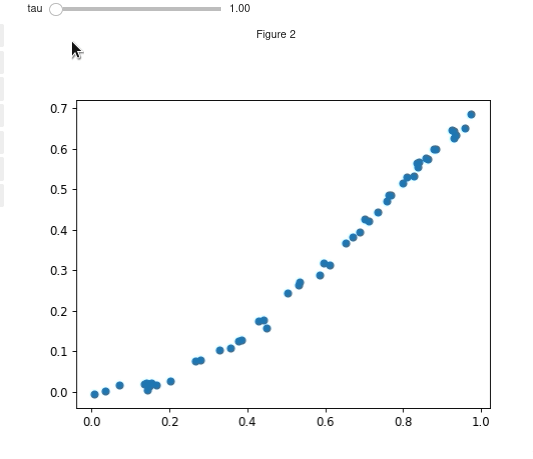
Basic example
N = 50
x = np.random.rand(N)
def f_y(x, tau):
    return np.sin(x*tau)**2 + np.random.randn(N)*.01
fig, ax, controls = interactive_scatter(x,f_y, tau = (1, 2*np.pi, 100))
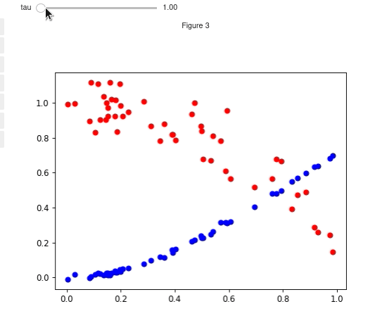
Multiple functions and broadcasting
You can also use multiple functions. If there are fewer x inputs than y inputs then the x input will be broadcast
to fit the y inputs. Similarly y inputs can be broadcast to fit x. You can also choose colors and sizes for each line
N = 50
x = np.random.rand(N)
def f_y1(x, tau):
    return np.sin(x*tau)**2 + np.random.randn(N)*.01
def f_y2(x, tau):
    return np.cos(x*tau)**2 + np.random.randn(N)*.1
fig, ax, controls = interactive_scatter(x, [f_y1, f_y2],
                                        tau = (1, 2*np.pi, 100),
                                        c = ['blue', 'red'])
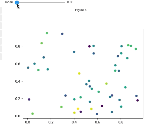
Functions for both x and y
The function for y should accept x and then any parameters that you
will be varying. The function for x should accept only the parameters.
N = 50
def f_x(mean):
    return np.random.rand(N) + mean
def f_y(x, mean):
    return np.random.rand(N) - mean
fig, ax, controls = interactive_scatter(f_x, f_y,
                                        mean = (0, 1, 100),
                                        s = None,
                                        c = np.random.randn(N))
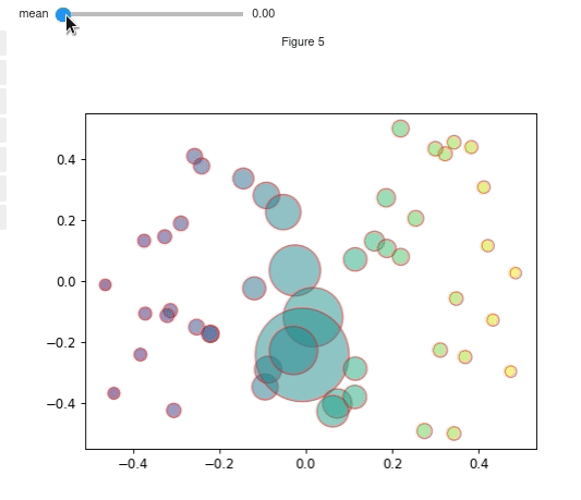
Using functions for other attributes
You can also use functions to dynamically update other scatter attributes such as the size, color, edgecolor, and alpha.
The function for alpha needs to accept the parameters but not the xy positions as it affects every point.
The functions for size, color and edgecolor all should accept x, y, <rest of parameters>
N = 50
mean =  0
x = np.random.rand(N) + mean - .5
def f(x, mean):
    return np.random.rand(N) + mean - .5
def c_func(x,y, mean):
    return x
def s_func(x,y, mean):
    return np.abs(40/(x+.001))
def ec_func(x,y,mean):
    if np.random.rand() >.5:
        return 'black'
    else:
        return 'red'
fig, ax, sliders = interactive_scatter(x, f, mean = (0, 1, 100),
                                    c= c_func,
                                    s=s_func,
                                    edgecolors=ec_func,
                                    alpha=.5,
                                    )
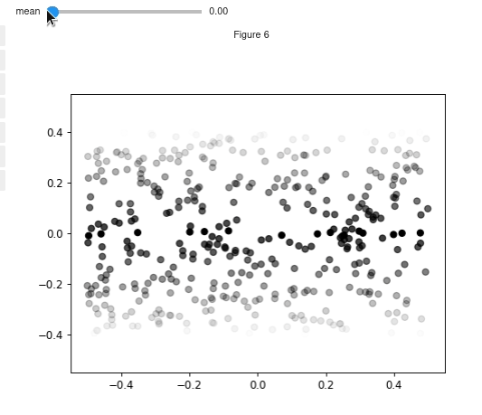
Modifying the colors of individual points
N = 500
x = np.random.rand(N) - .5
y = np.random.rand(N) - .5
def f(mean):
    x = (np.random.rand(N)-.5) + mean
    y = 10*(np.random.rand(N)-.5) + mean
    return x, y
def threshold(x,y,mean):
    colors = np.zeros((len(x), 4))
    colors[:,-1] = 1
    deltas = np.abs(y - mean)
    idx = deltas < .01
    deltas /= deltas.max()
    colors[~idx, -1] = np.clip(.8-deltas[~idx],0,1)
    return colors

fig, ax, sliders = interactive_scatter(x, y, mean = (0, 1, 100), alpha = None, c= threshold)
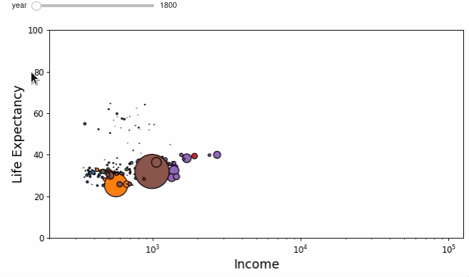
Putting it together - Wealth of Nations
Using interactive_scatter we can recreate the interactive wealth of nations plot using Matplotlib!
The data preprocessing was taken from an example notebook for the bqplot library. If you are working in jupyter notebooks then you should definitely check out bqplot!
# this preprocessing was taken wholesale from the bqplot example
# bqplot is under the apache license, see their license file here:
# https://github.com/bqplot/bqplot/blob/55152feb645b523faccb97ea4083ca505f26f6a2/LICENSE
data = pd.read_json('nations.json')
def clean_data(data):
    for column in ['income', 'lifeExpectancy', 'population']:
        data = data.drop(data[data[column].apply(len) <= 4].index)
    return data

def extrap_interp(data):
    data = np.array(data)
    x_range = np.arange(1800, 2009, 1.)
    y_range = np.interp(x_range, data[:, 0], data[:, 1])
    return y_range

def extrap_data(data):
    for column in ['income', 'lifeExpectancy', 'population']:
        data[column] = data[column].apply(extrap_interp)
    return data
data = clean_data(data)
data = extrap_data(data)
income_min, income_max = np.min(data['income'].apply(np.min)), np.max(data['income'].apply(np.max))
life_exp_min, life_exp_max = np.min(data['lifeExpectancy'].apply(np.min)), np.max(data['lifeExpectancy'].apply(np.max))
pop_min, pop_max = np.min(data['population'].apply(np.min)), np.max(data['population'].apply(np.max))
def x(year):
    return data['income'].apply(lambda x: x[year-1800])

def y(x,year):
    return data['lifeExpectancy'].apply(lambda x: x[year-1800])

def s(x, y, year):
    pop =  data['population'].apply(lambda x: x[year-1800])
    return 4000*pop.values/pop_max
regions = data['region'].unique().tolist()
c =  data['region'].apply(lambda x: list(TABLEAU_COLORS)[regions.index(x)]).values
fig, ax, controls = interactive_scatter(x, y, s=s, year = np.arange(1800,2009),c=[c],
                                        edgecolors='k',
                                        slider_format_string='{:d}',
                                        figsize=(10,4.8))
fs = 15
ax.set_xscale('log')
ax.set_ylim([0,100])
ax.set_xlim([200,income_max*1.05])
ax.set_xlabel('Income', fontsize=fs)
_ = ax.set_ylabel('Life Expectancy', fontsize=fs)