Scatter#
%matplotlib ipympl
import matplotlib.pyplot as plt
import numpy as np
import pandas as pd
from matplotlib.colors import TABLEAU_COLORS

import mpl_interactions.ipyplot as iplt
Basic example#
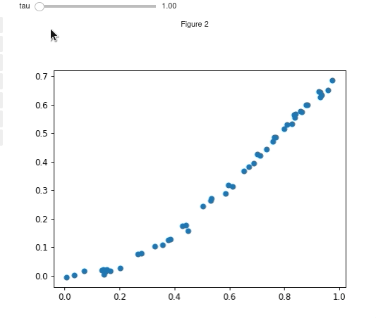
N = 50
x = np.random.rand(N)


def f_y(x, tau):
    return np.sin(x * tau) ** 2 + np.random.randn(N) * 0.01


fig, ax = plt.subplots()
controls = iplt.scatter(x, f_y, tau=(1, 2 * np.pi, 100))
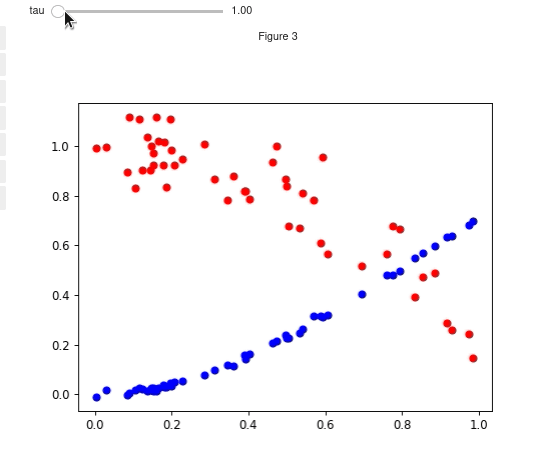
Using functions and broadcasting#
You can also use multiple functions. If there are fewer x inputs than y inputs then the x input will be broadcast to fit the y inputs. Similarly y inputs can be broadcast to fit x. You can also choose colors and sizes for each line
N = 50
x = np.random.rand(N)


def f_y1(x, tau):
    return np.sin(x * tau) ** 2 + np.random.randn(N) * 0.01


def f_y2(x, tau):
    return np.cos(x * tau) ** 2 + np.random.randn(N) * 0.1


fig, ax = plt.subplots()
controls = iplt.scatter(x, f_y1, tau=(1, 2 * np.pi, 100), c="blue", s=5)
_ = iplt.scatter(x, f_y2, controls=controls, c="red", s=20)
Functions for both x and y#
The function for y should accept x and then any parameters that you will be varying. The function for x should accept only the parameters.
N = 50


def f_x(mean):
    return np.random.rand(N) + mean


def f_y(x, mean):
    return np.random.rand(N) - mean


fig, ax = plt.subplots()
controls = iplt.scatter(f_x, f_y, mean=(0, 1, 100), s=None, c=np.random.randn(N))
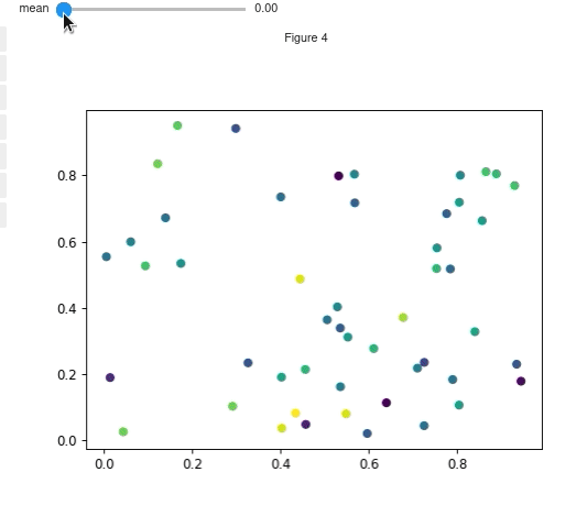
Using functions for other attributes#
You can also use functions to dynamically update other scatter attributes such as the size, color, edgecolor, and alpha.
The function for alpha needs to accept the parameters but not the xy positions as it affects every point. The functions for size, color and edgecolor all should accept x, y, <rest of parameters>
N = 50
mean = 0
x = np.random.rand(N) + mean - 0.5


def f(x, mean):
    return np.random.rand(N) + mean - 0.5


def c_func(x, y, mean):
    return x


def s_func(x, y, mean):
    return np.abs(40 / (x + 0.001))


def ec_func(x, y, mean):
    if np.random.rand() > 0.5:
        return "black"
    else:
        return "red"


fig, ax = plt.subplots()
sliders = iplt.scatter(
    x,
    f,
    mean=(0, 1, 100),
    c=c_func,
    s=s_func,
    edgecolors=ec_func,
    alpha=0.5,
)
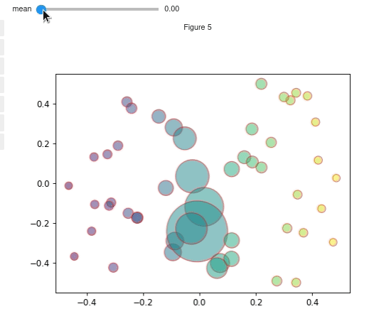
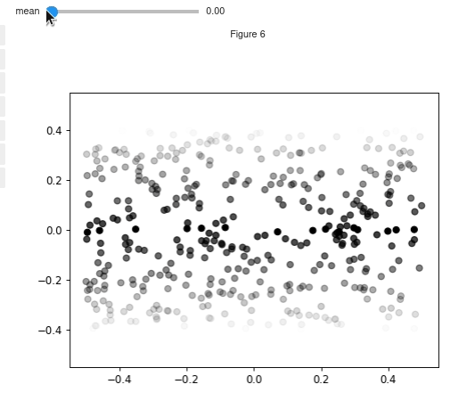
Modifying the colors of individual points#
N = 500
x = np.random.rand(N) - 0.5
y = np.random.rand(N) - 0.5


def f(mean):
    x = (np.random.rand(N) - 0.5) + mean
    y = 10 * (np.random.rand(N) - 0.5) + mean
    return x, y


def threshold(x, y, mean):
    colors = np.zeros((len(x), 4))
    colors[:, -1] = 1
    deltas = np.abs(y - mean)
    idx = deltas < 0.01
    deltas /= deltas.max()
    colors[~idx, -1] = np.clip(0.8 - deltas[~idx], 0, 1)
    return colors


fig, ax = plt.subplots()
sliders = iplt.scatter(x, y, mean=(0, 1, 100), alpha=None, c=threshold)
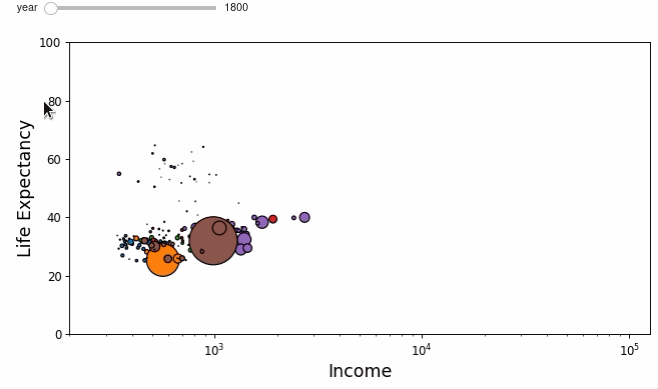
Putting it together - Wealth of Nations#
Using interactive_scatter we can recreate the interactive wealth of nations plot using Matplotlib!
The data preprocessing was taken from an example notebook from the bqplot library. If you are working in jupyter notebooks then you should definitely check out bqplot!
Data preprocessing#
# this cell was taken wholesale from the bqplot example
# bqplot is under the apache license, see their license file here:
# https://github.com/bqplot/bqplot/blob/55152feb645b523faccb97ea4083ca505f26f6a2/LICENSE
data = pd.read_json("nations.json")


def clean_data(data):
    for column in ["income", "lifeExpectancy", "population"]:
        data = data.drop(data[data[column].apply(len) <= 4].index)
    return data


def extrap_interp(data):
    data = np.array(data)
    x_range = np.arange(1800, 2009, 1.0)
    y_range = np.interp(x_range, data[:, 0], data[:, 1])
    return y_range


def extrap_data(data):
    for column in ["income", "lifeExpectancy", "population"]:
        data[column] = data[column].apply(extrap_interp)
    return data


data = clean_data(data)
data = extrap_data(data)
income_min, income_max = np.min(data["income"].apply(np.min)), np.max(data["income"].apply(np.max))
life_exp_min, life_exp_max = np.min(data["lifeExpectancy"].apply(np.min)), np.max(
    data["lifeExpectancy"].apply(np.max)
)
pop_min, pop_max = np.min(data["population"].apply(np.min)), np.max(
    data["population"].apply(np.max)
)
Define functions to provide the data#
def x(year):
    return data["income"].apply(lambda x: x[year - 1800])


def y(x, year):
    return data["lifeExpectancy"].apply(lambda x: x[year - 1800])


def s(x, y, year):
    pop = data["population"].apply(lambda x: x[year - 1800])
    return 6000 * pop.values / pop_max


regions = data["region"].unique().tolist()
c = data["region"].apply(lambda x: list(TABLEAU_COLORS)[regions.index(x)]).values
Marvel at data#
fig, ax = plt.subplots(figsize=(10, 4.8))
controls = iplt.scatter(
    x,
    y,
    s=s,
    year=np.arange(1800, 2009),
    c=c,
    edgecolors="k",
    slider_formats="{:d}",
    play_buttons=True,
    play_button_pos="left",
)
fs = 15
ax.set_xscale("log")
ax.set_ylim([0, 100])
ax.set_xlim([200, income_max * 1.05])
ax.set_xlabel("Income", fontsize=fs)
_ = ax.set_ylabel("Life Expectancy", fontsize=fs)